

Revealing a Bright Bathroom’s Darker Side
October 30, 2026
One bathroom photographed two ways, showing how lighting changes the story a space tells.
Interior designers in Las Vegas spend weeks on decisions most people never consciously notice. You compare countertop slabs in person, balance one wood grain against another, hunt down the right textile and choose fixtures for the way they will catch the light. Nothing in a completed room is there by accident. Las Vegas interior design photography should respect that level of intention, yet the final record of a project is often a handful of phone photos taken in a hurry on handover day. I’m Pete, the photographer behind Flashqbe, and in this post I’ll walk you through a personal study I shot in a Las Vegas bathroom, where I used off camera flash with grids to turn a bright, open room into something dark and dramatic. Along the way, I’ll explain what that kind of control over light can do for your portfolio.
Why don’t the photos I take ever look as good as the space I designed?
They don’t look as good because you’re likely using a phone that can only use whatever light is already in the room. Regular overhead light tends to flatten texture, shift color and turn windows into bright white rectangles.
On top of that, phone cameras apply heavy processing that smooths away fine detail. A honed stone can end up looking like laminate, and a hand troweled plaster wall can read as flat paint.
When the contractor takes these photos at handover, he is usually doing a quick favor at the end of a long build. His craft is building the room well, and he has done that. Photographing it well is a separate craft, and it deserves the same attention you gave every material in the space.
Why does a professional portfolio matter so much for an interior designer?
Your portfolio shapes what a prospective client expects from you before you ever meet. People investing in a significant home project are buying a feeling as much as a room, and your images are often their very first experience of how your spaces feel.
Careful, well lit photography tells that person their investment will be treated with the same care. Rushed photos send the opposite message, quietly undercutting work that was never rushed. In that sense, the photos do more than document a project. They help set the value of the next one.
What was this Las Vegas bathroom photography study?
This set was a personal study, made to see how far light alone could change the mood of one room. I photographed this same bathroom with even light from edge to edge, the bright and inviting look that real estate listings call for.
For this set, I went in the opposite direction. I let shadow fill most of the frame and lit only the materials I wanted a viewer to notice: the brushed metal, the ribbed glass and the rich grain of the wood. No client asked for these images. I made them because I wanted to know whether a naturally bright, open bathroom could hold a dark, dramatic atmosphere without losing the character of its materials. The answer was yes, and the reason why is useful for any designer thinking about how their work is photographed.
How do photographers capture texture in dark interior photos?
As a designer, you already know how to use light to make a room feel open and welcoming. Overhead fixtures and recessed lights bounce off the ceiling, the walls and the floor until the whole space is filled with soft, even light. That is exactly what a room needs when people are living in it, but for these images, the light has to work in the opposite way. Texture appears when light skims across a surface from the side instead of striking it head on. Light from straight ahead, or light that reaches a surface from every direction at once, fills in the tiny ridges and grooves of a material, so it reads as smooth and flat.
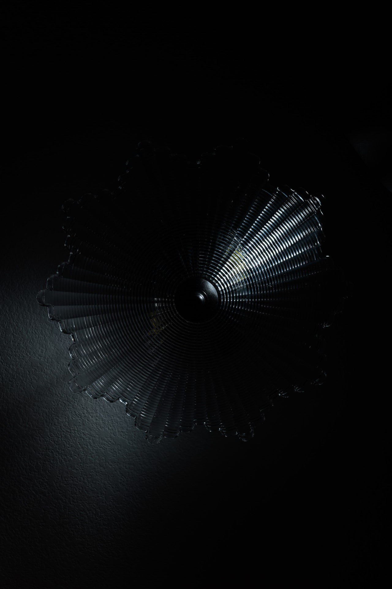
Raking light (think of how a rake skims along a surface) gives ribbed glass its rhythm, with every ridge catching its own line of highlight and shadow.
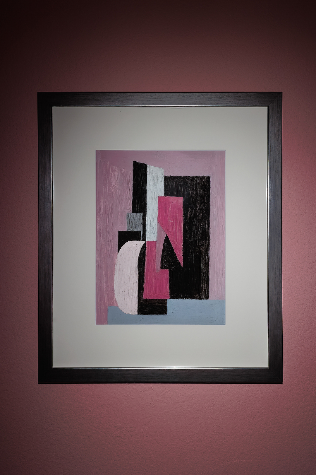
Light from the side picks out the fine lines in brushed metal that flat, even light would smooth away.
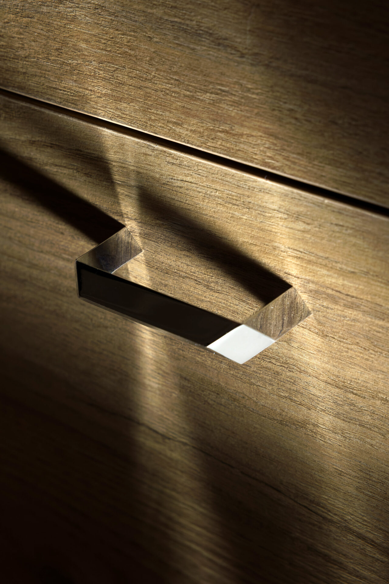
Low, raking light lifts the grain out of the wood, so the surface looks the way it feels in your hand.
The above principles shaped every frame in this study. Keeping the surrounding room dark makes those textures and details stand out even more, because nothing else competes for attention. The result produces an effect that adds dimension, making an image appear closer to how the materials actually feel.
What does a grid do on an off camera flash?
A grid is a honeycomb shaped attachment that narrows a flash into a tight beam, so the light lands only where I aim it. Without a grid, a flash spreads across the whole room, brightening everything at once and erasing the shadows that create mood.
With a grid, I can light the edge of a vanity, a single faucet or one strip of glass while everything around it stays dark. Taking the flash off the camera matters just as much. It lets me place that narrow beam to the side of a surface or above it, at whatever angle suits the material, instead of firing straight from where I stand. That is how I approach flash on every kind of shoot: light placed with a clear reason behind it, rather than light added simply because a flash is available.
Can lighting change the mood of an interior photo?
Yes. Light decides whether the same room feels airy and welcoming or quiet and dramatic.
For a designer, that matters because a space is designed to feel a certain way. If your concept leaned toward calm, warm intimacy, a bright, flat photo misrepresents it as much as a moody photo would misrepresent a light filled family kitchen. Controlling light means the mood in the images can follow the mood in your concept, whichever direction it takes.
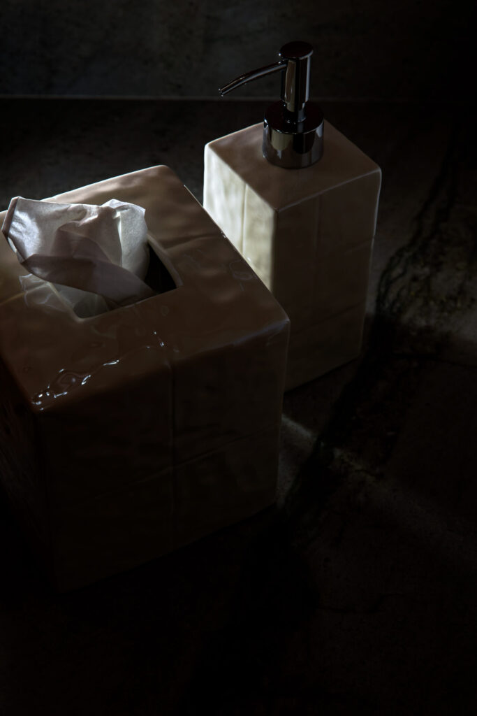
 ↔
The only difference between these two photos is how I chose to use the direction, intensity and spread of the light from my Godox V100 flash.
Should interior designers use dark, dramatic photos for their portfolios?
It depends entirely on your creative intentions. A darker style of images could work better to showcase a bedroom design that was meant to feel cozy. But a darker style would make less sense to showcase a kitchen remodel.
A strong portfolio can hold both styles, so long as the lighting style suits the image. I think normally exposed photos best show how you, as a designer, relate design elements to each other.
Moodier images like this speak to material choices and feelings. Why not hit both those notes in how you feature your work? It’s worth planning for both looks before the shoot rather than hoping one set can do everything.
Do moody interior design photos perform well on Instagram?
Moody photos tend to stand out because they break the pattern of the feed. Most interior accounts post bright, evenly lit rooms, so a frame that is mostly shadow with one glowing material gives a scrolling thumb a reason to stop. That pause matters. The longer someone looks at a post, the more likely they are to like it, save it or tap through to your profile, and Instagram tends to show posts that hold attention to more people.
Detail shots also suit the way people see Instagram. On a phone screen, a wide shot of a whole room shrinks into a lot of small pieces, while a close crop of ribbed glass or brushed metal fills the frame and reads clearly at any size. A vertical crop of a single vignette takes up even more of the screen, so your work gets more of the viewer’s attention.
These images also work well as part of a larger story. A carousel that opens with one dramatic detail and then reveals the full, bright room gives followers a reason to swipe all the way through, the same way the two sets in this study play off each other. Sharing both looks lets your feed show the decisions behind a space as well as the space itself.
Why does accurate color matter in Las Vegas interior design photography?
Accurate color matters because your client approved a specific finish, and the photo should show that finish rather than an approximation of it. Much like product photography, interior work has to set honest expectations, so the person viewing the image knows exactly what they would be getting.
Mixed light is the usual culprit. Warm bulbs over a vanity combined with cooler daylight from a window can pull white stone toward yellow or push gray tile toward blue. Lighting key surfaces with flash gives those areas one consistent source of light, which makes it far easier to keep color true from capture to final edit. My editing stays subtle and realistic, so the stone, metal and wood look the way they do in person.
What is it like to work with an interior design photographer in Las Vegas?
Working with me is a collaboration built around your vision. Before shoot day, we talk through the sourcing choices and architectural highlights you are proudest of, so every frame centers on the details you worked hardest to specify.
During the shoot, we can review framing together, adjust styling and catch small imperfections, such as a slightly uneven towel or a stray reflection, before the final photo is taken. You leave knowing the images reflect what you intended, rather than waiting and hoping. If I am showing up to your project and you are not there, I always take safety shots in addition to what we have planned and agreed upon.
How can I tell if my current portfolio is holding my design business back?
Start by looking at your most recent project photos the way a stranger would. Ask whether they show the craftsmanship, atmosphere and detail you actually delivered, or only the outline of the room.
If the photos fall short of the work, that gap is worth closing before your next project wraps. I would be glad to talk through what you have and how your next build could look on camera. The most direct way to reach me is a message on Instagram or Facebook, and I would love to hear about the project you are working on now.